去符号化,符合业态的场域营造。
De-symbolize and create a field in line with the function
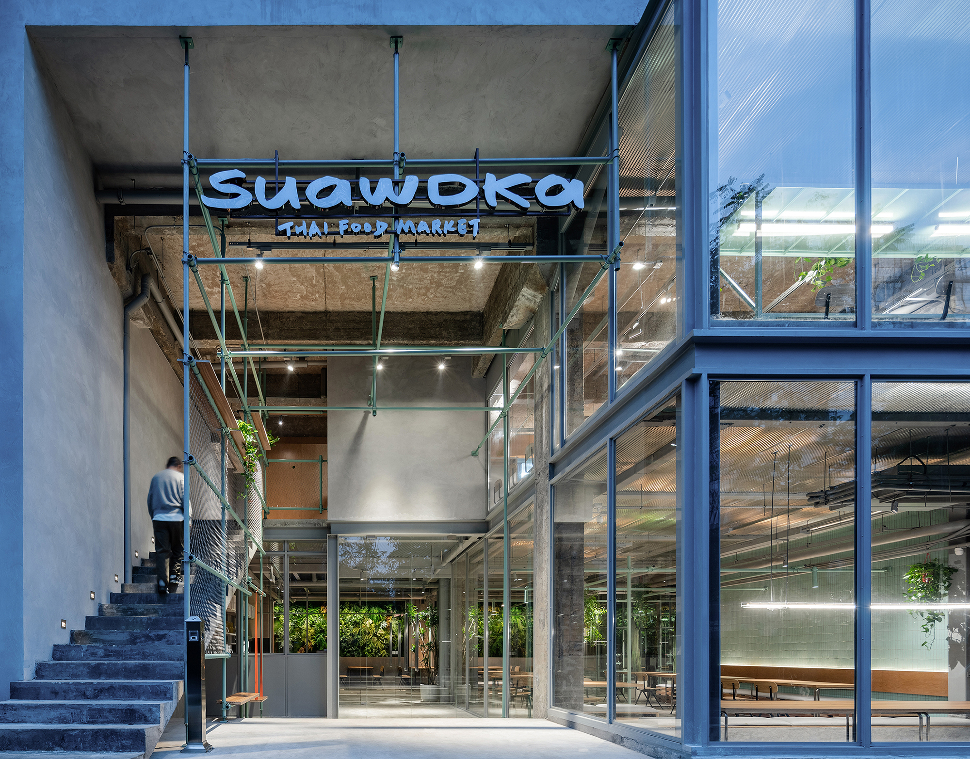
项目位于济南C7商业艺术街区内,前身是一个封闭光线很差的临街铺位,和业主前期沟通中我们提出了发力点是建筑空间的梳理,然后深入到道具细节,省去中间装饰环节,设计推向两极发展。拆除原有笨重的玻璃幕墙,四分之一面积还给了社区,并把一二楼垂直交通动线放在了室外中庭。设计之初做了大量研究用的SU分析模型和业主讨论后决定把厨房放置在二楼,使得一楼视线有了穿透性用一个透明井道的传菜电梯来解决厨房在二楼出品不便的功能性问题。
The project is located at C7 commercial art street block, in Jinan. The predecessor of the site is a street shop with extremely poor light. In the preliminary communication with the owner, we proposed that the starting point of this project should be the sorting of the architectural space, and then the details of the props should be explored eliminating the middle decoration process and developing the design to the Bipolar development. A quarter of the area was returned to the community and the vertical circulation of the first and second floors were placed in the outdoor atrium through demolishing the original bulky glass curtain wall. After the discussion with the owner by the Sketchup models which have done with a lot of research at the beginning of the design concept, it was decided to place the kitchen on thesecond floor, which increased the visibility of the first floor, and a transparent elevator with a transparent shaft was used to solve the problem and inconvenient functional issues that the kitchen was produced on the second floor.
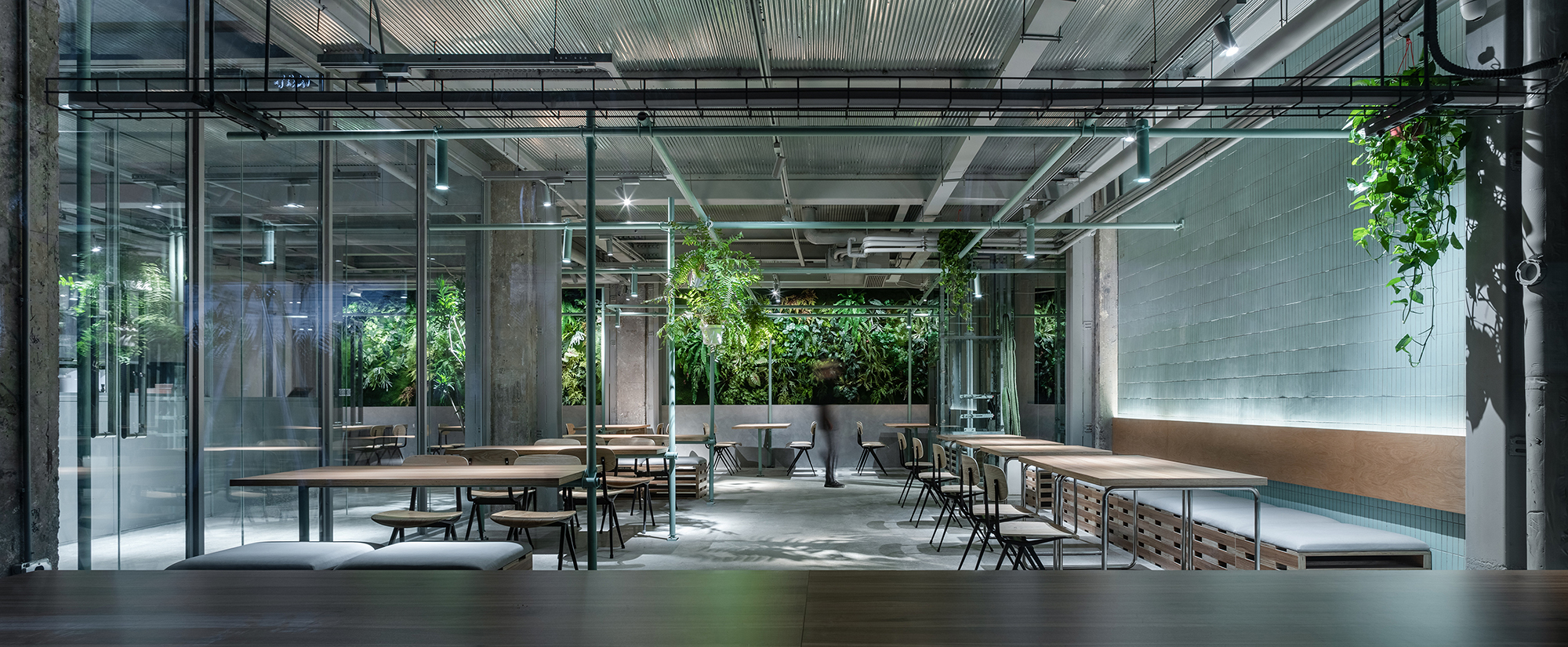
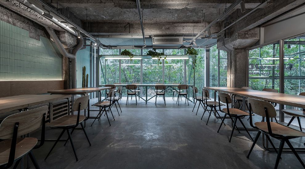
墙面上做了大面积镜子,使室内垂直绿化墙的视觉长度延伸了一倍,空间更加通透轻盈。内退后建筑也增加了可视景观的玻璃幕墙延展面避免了就餐空间死角位,建筑物内铲除了之前店铺留下的装饰表皮恢复到最初质感和园区原有厂房相融合,入口灰空间和街道相连融入社区,内退反而凸显。社区绿化率很高,在店铺内我们增加了绿植盆栽和公共空间又是一种无形连接,有效增加了空间呼吸感与通透性。润物细无声,无形的各种空间,绿植等的连接也许非专业是觉察不到,但就是这些让就餐舒适性和之前是无可比拟的。空间是给人触摸与感知,而不是一味的追求视觉盛宴,朴实内敛的建筑更会经得起时间考验。
A large-area mirror is made on the wall to double the visual length of the indoor vertical green wall, making the space more transparent and lighter. The retreating building also adds an extended surface of the glass curtain wall with a viewable landscape to avoid blind spots in the dining space. The decoration skin left by the previous shop is removed from the building and the original texture is integrated with the one of original factory in the community. The negative space if the entrance is connected to the street and integrated into the community, but the inward retreat is prominent. The green ratio of the community is very high. In the shop, we have added greenery plants as the decoration invisible connecting to the public space, which effectively increases the breathing permeability of the space and a relaxing dining experience. Moisturizing things are silent, invisible spaces, green plants and other connections may not be seen by non-professionals, but it is these that make dining comfort incomparable to the previous ones. The space is for people to touch and perceive, instead of blindly pursuing the so-called visual feast. The authentic and introverted architecture will stand the test of time.
脚手架系统一镜到底,装置功能性。
The scaffolding system runs through the entire space, the functionality of the space installation.
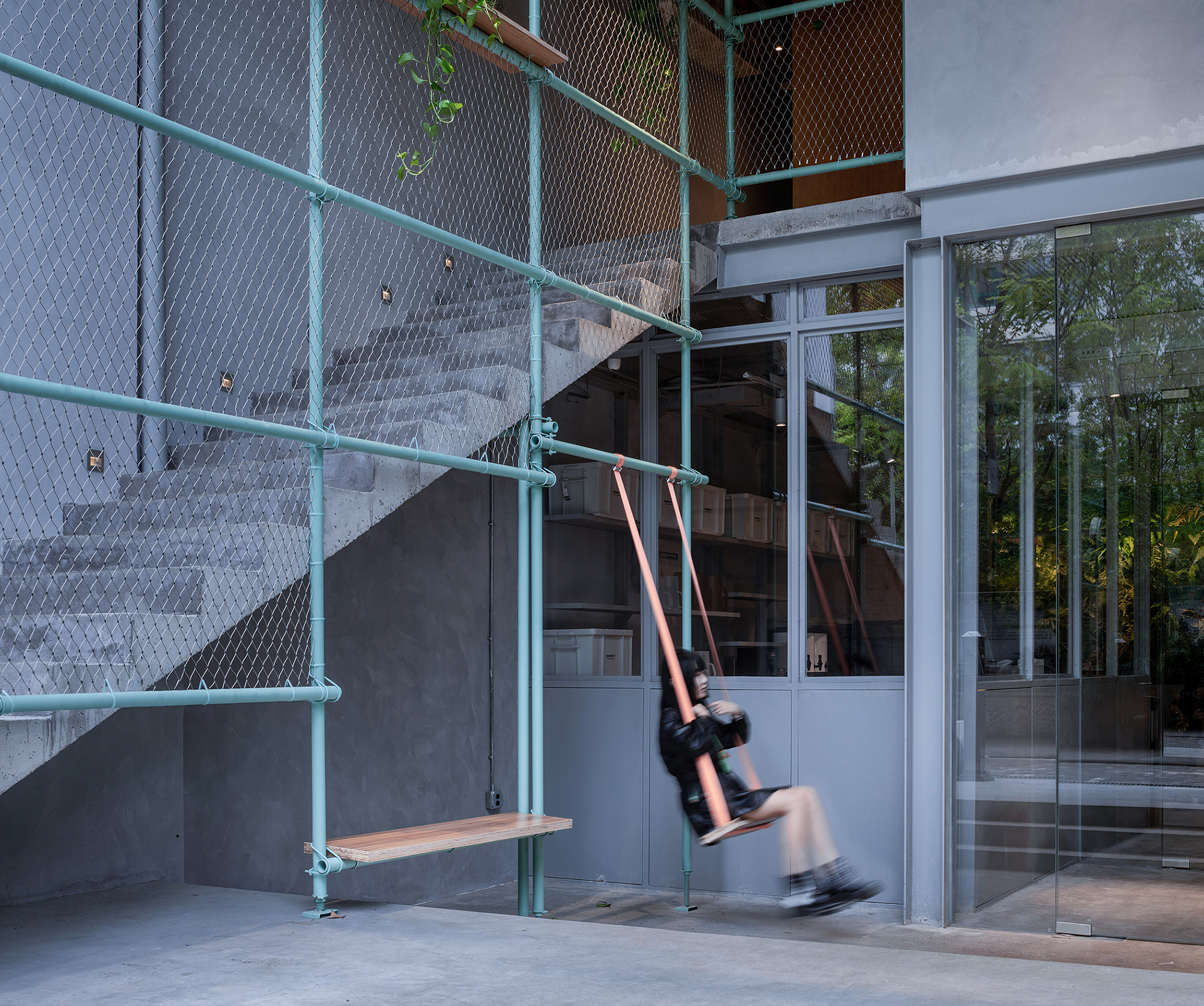
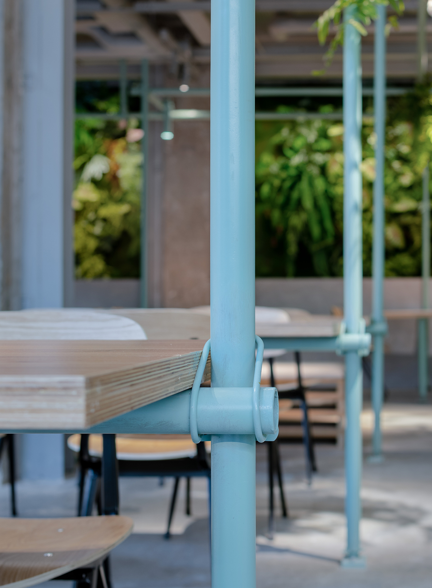
在完成了建筑空间梳理和道具的细节后,中间又增加了脚手架系统装置,工业绿色脚手架从入口灰空间贯穿到室内变成了空间焦点,但是我们贯彻了不做无用装置的设计理念,脚手架既是店招和中庭秋千固定结构,到室内后变成了桌子支撑甚至局部灯光照明系统。工业绿脚手架和绿色瓷砖墙形成了空间调和主体色,起到了画龙点睛的作用。
After finishing the architectural space sorting and the details of the props, a layer of scaffolding system was added in the middle. The industrial green scaffolding penetrates from the entrance negative space to the interior and becomes the focal point of the space, but we implement the concept of not making useless installations. The idea is that the scaffolding is not only the shop sign, but also the fixed structure of the atrium swing. It becomes the support system of the table and even the local lighting system when it is indoors. The industrial green scaffolding and the green tile wall form the main color of the space harmony, which plays the role of finishing touch.
多层板家具的应用
Application of plywood furniture
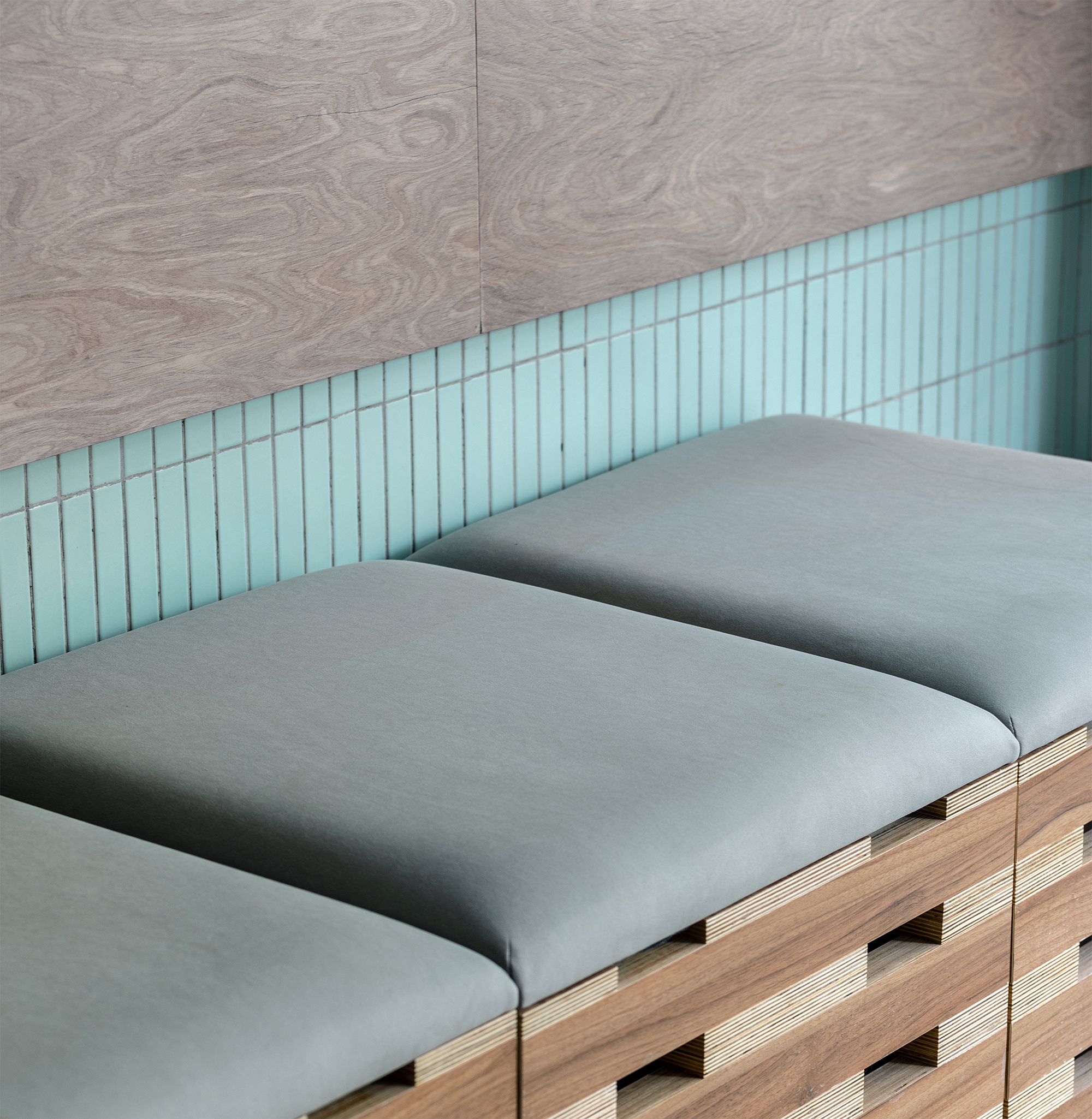
为增加建筑层次感一楼地面下挖了400mm,原建筑地梁变成了就餐长凳,我们设计了这个餐厅部分家具,强调细节但也点到为止,所有细节服从整体不做用力过猛的设计。由于预算有限我们采了用国产多层板,多层板温润的质感给空间带来了温度,自然而亲切。这次非商业化餐饮空间设计实践还有很多不完善和待改进的空间,但是我们尝试了区别于视网膜建筑另外一种可能性探索,做务实亲切低成本建筑空间是我们一直追求的价值观。
In order to increase the layering of the building, 400mm was dug under the ground on the first floor, and the exposed ground beam of the original building became a dining bench. We designed some of the table and chair furniture of this restaurant, emphasizing the details but restraining it. All details Obey the overall design and don't make excessive force. Due to the limited budget, we adopted domestic plywood. The warm texture of the plywood brings warmth to the space, which is natural and friendly. There are still many imperfections and room for improvement in the design practice of non-commercial dining space. However, we have tried to explore another possibility that is different from retina architecture. We have always been a pragmatic and friendly low-cost architectural space as the values we are pursuing.
幽默
Sense of humor
在所有严肃建筑形式与充分研讨的背后,看似粗野原始中其实隐藏众多细节,就像餐厅名字
”SuaWDka“(刷我的卡)取代了SAWADIA(你好的真正泰文)一样,是经过精心选择后的“错误”
Behind all the serious architectural forms and thorough discussions, there are many details hidden in the seeming crude and primitive, just like the name of the restaurant"SuaWDka" (swiping my card) replaced SAWADIA (the meaning of Hello in Thai), which is a "mistake" after careful selection.
